Recommendations Configuration Examples
Overview
For each core page type, below are examples of treatments that closely align with our documented best practices.
Home Page
Highlights:
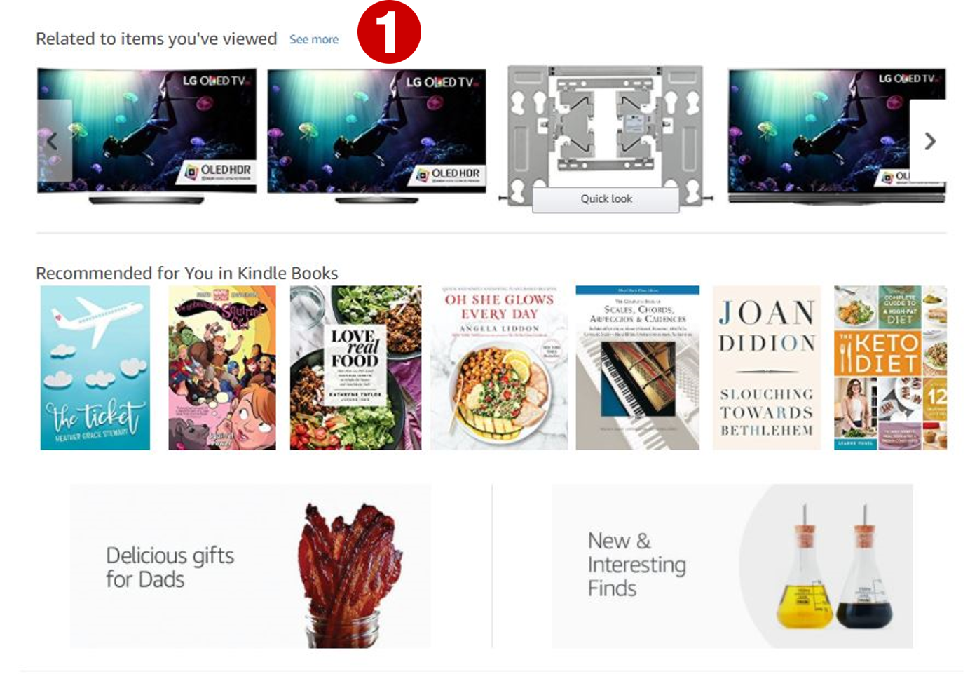
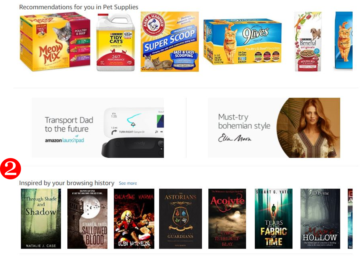
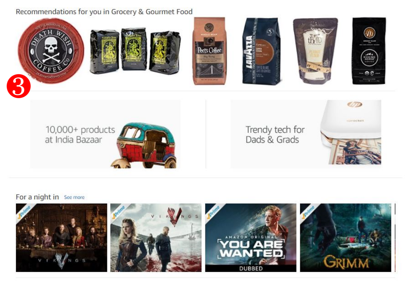
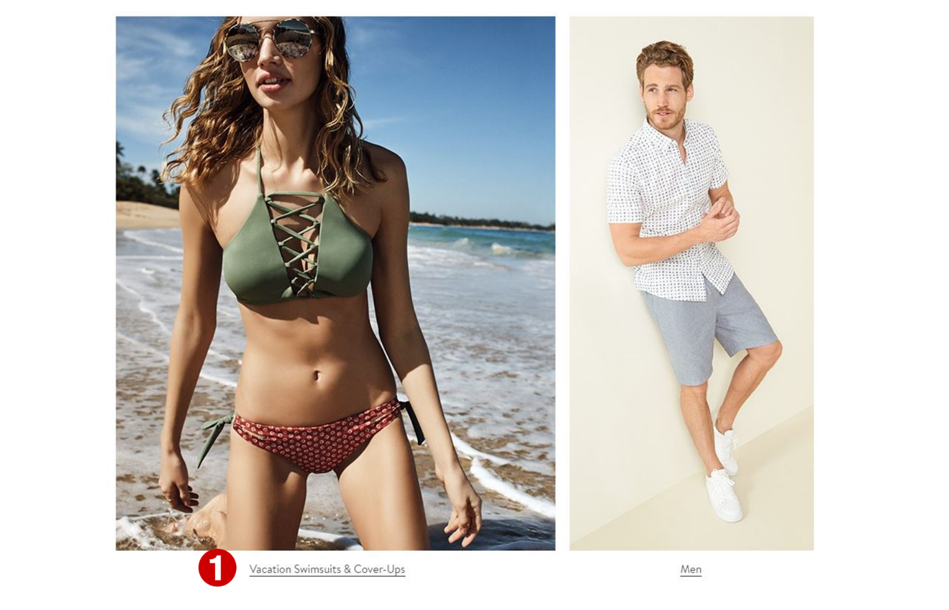
- Personalized recommendations “stack”.
- Themed placements with transparent messaging, and making it clear why most products are being recommended.
- Prices removed so as not to force upfront consideration of affordability.
- RVI breadcrumb in footer.

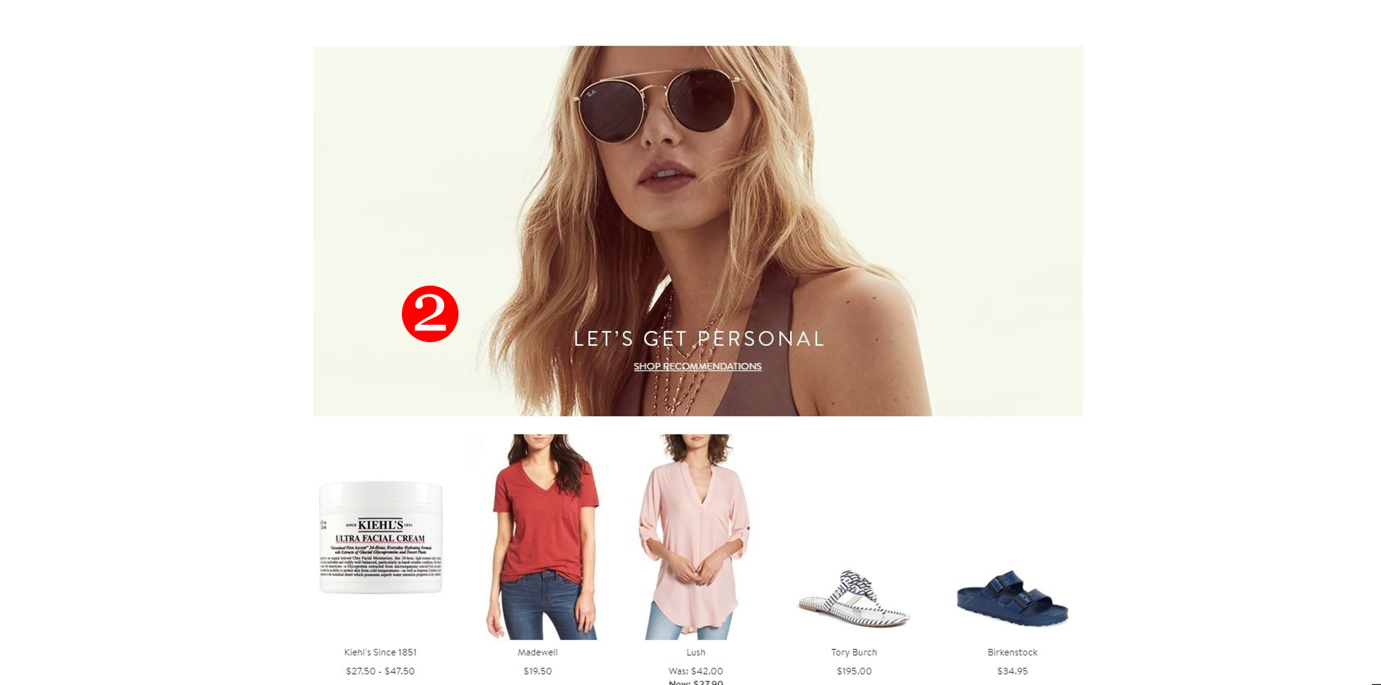
-
Curated feel with single (personalized) recommendations placement due to high-end merchant.
-
"Let’s get personal” prompt to view more personalized recommendations on a separate page.
-
RVI breadcrumb in footer (not pictured).

Search Page
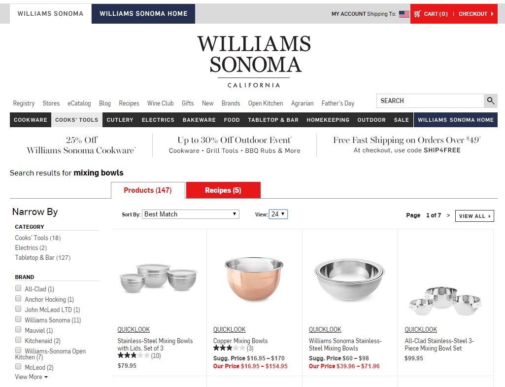
Highlights:
-
Positioning consistent with recommendations priority on Search page.
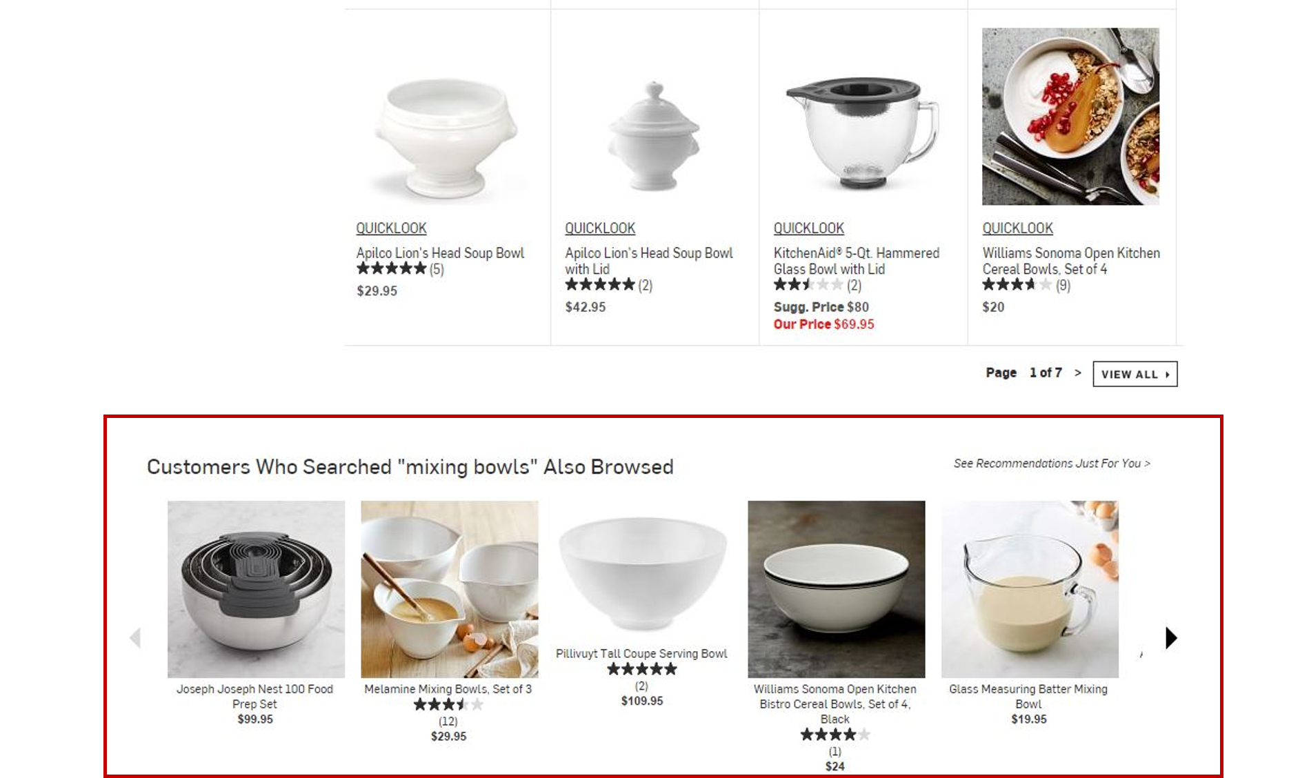
-
Strategy message references search term(s).
Category Page
Highlights:
- In-category recommendations based on the customer’s browse history.
- Vertical placement used to position recommendations higher up on page.
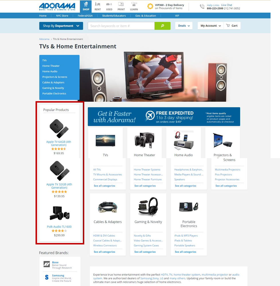
Item Page
Highlights:
-
Stacked similar items and cross-sell placements with prompts (“see more personalized picks”) to take customer to personalized page.
-
Recommendations do not obstruct salient product info.
-
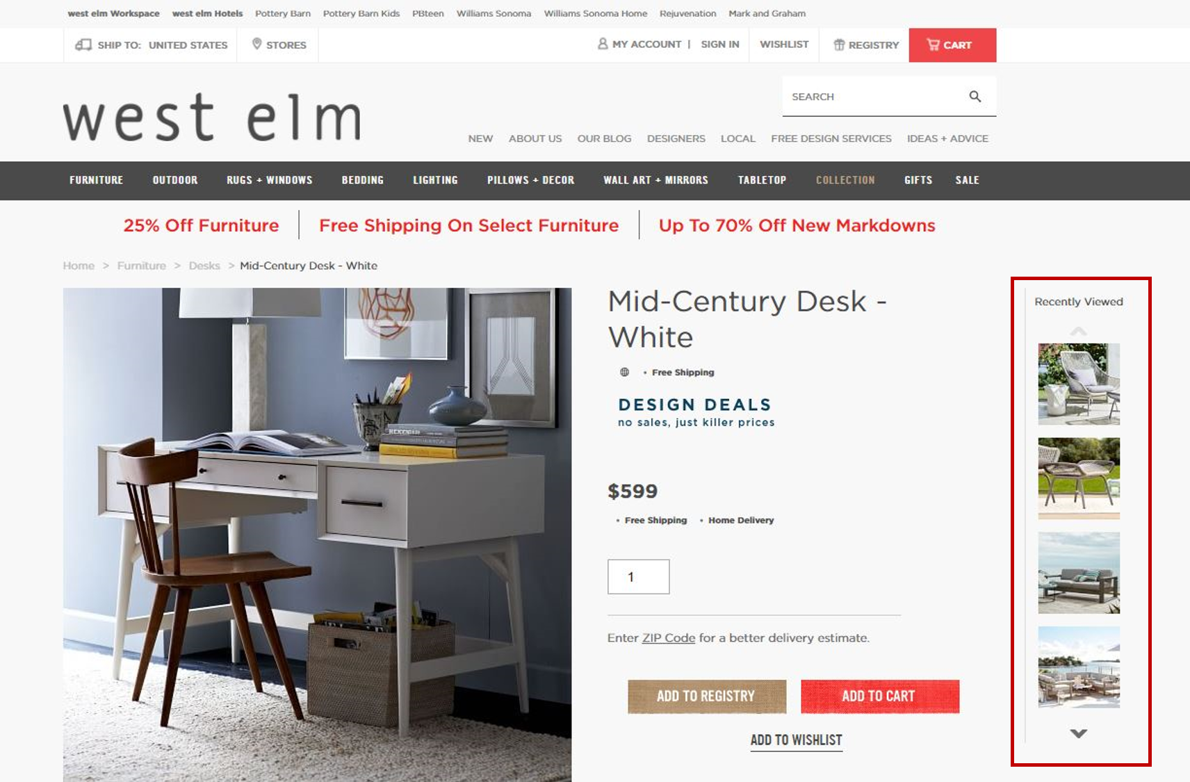
Persistent RVI placement docked to the right side of the page.
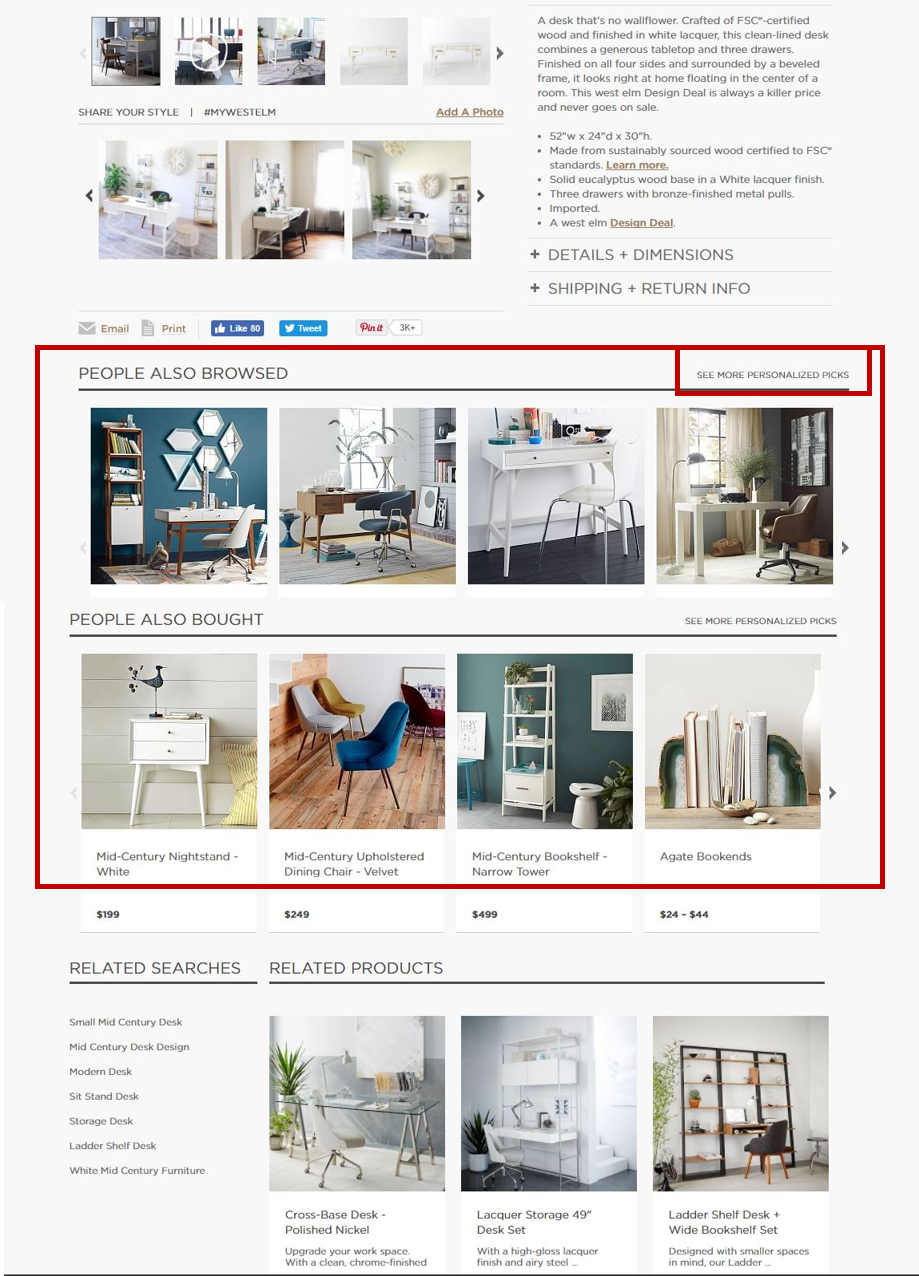
- FBT-type cross-sell placement enabling items to be added to cart without leaving the current page (through Quickview).
- Highly visual recommendations (that is, large images) as is appropriate for vertical.
- RVI placement at bottom of page (not shown).
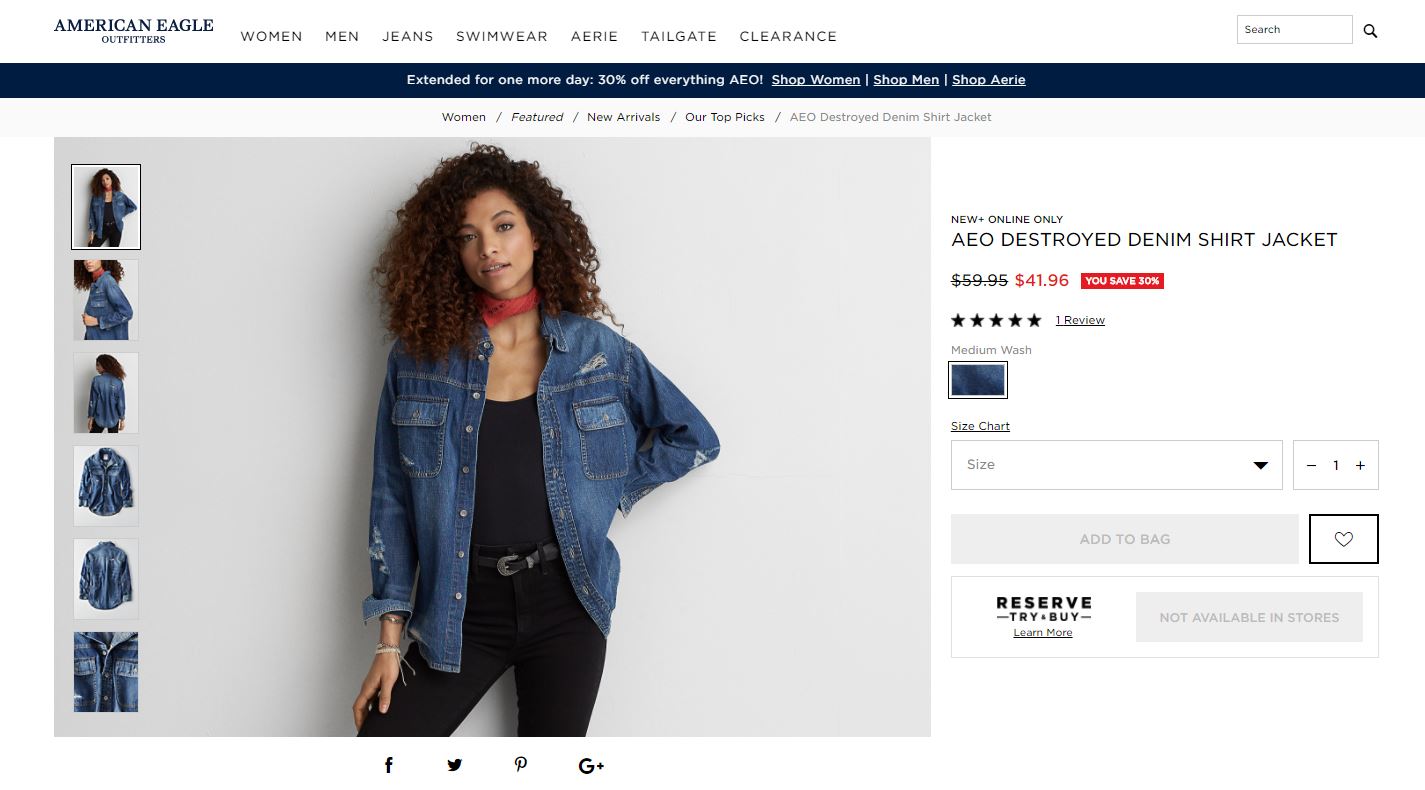
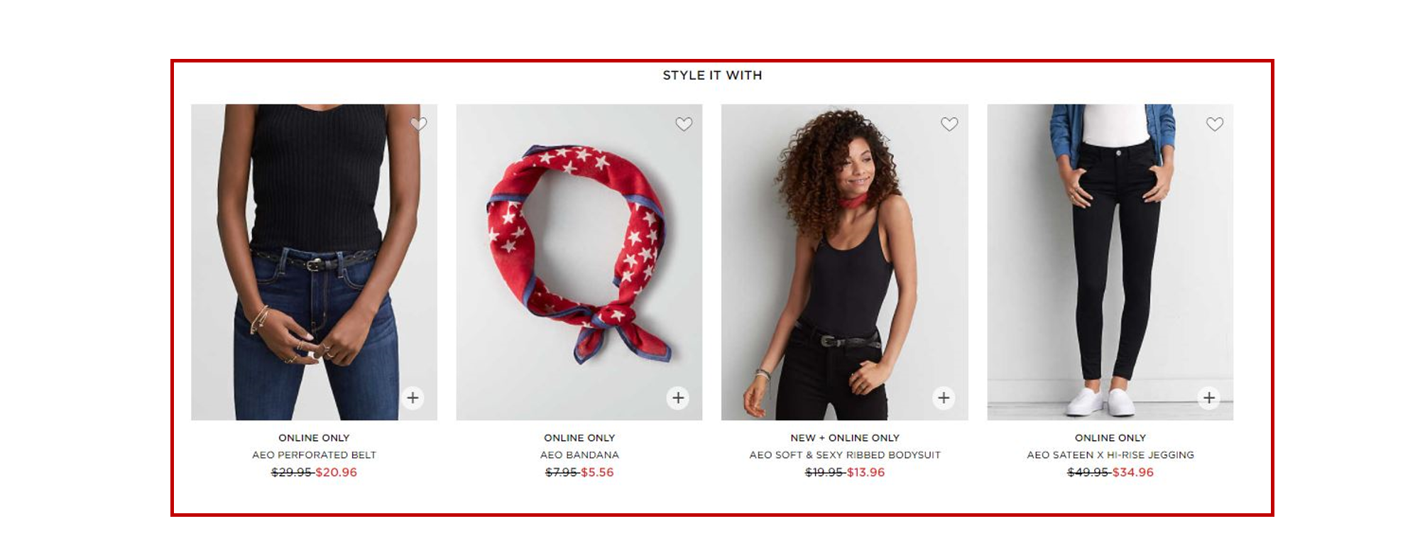
-
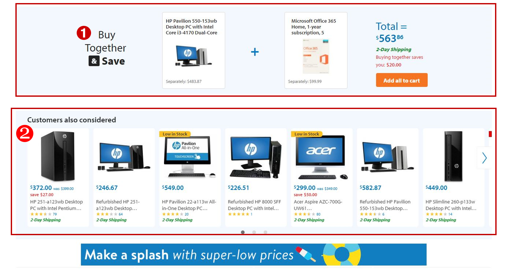
Bundle/cross-sell placement displaying compatibility-matched, incremental buys.
-
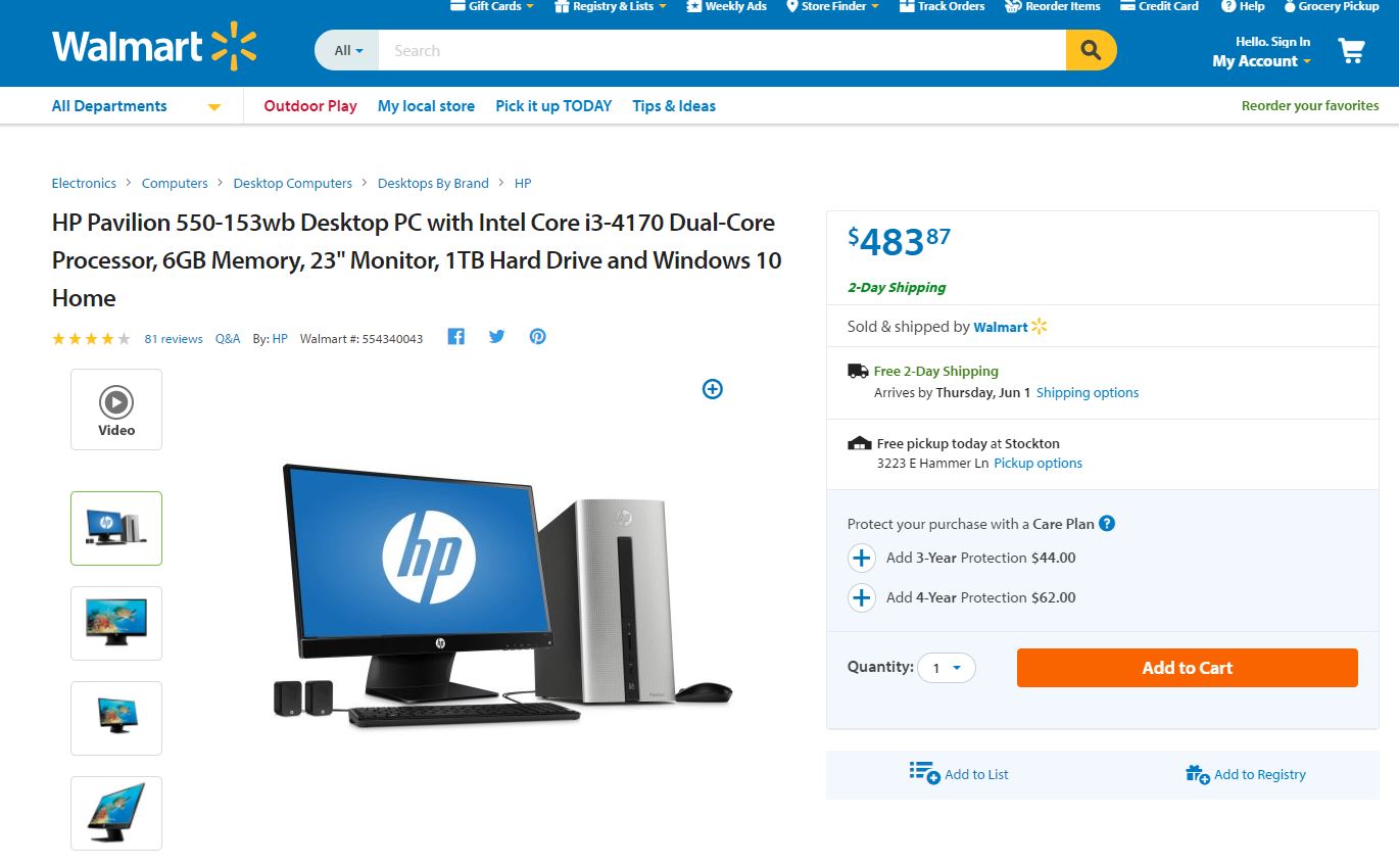
“Highlights” summary of salient product features prior to recommending alternative items.
-
Bottom-of-page placement (not pictured) recommending products based on the customer’s browse history.
Add to Cart Page
Highlights:
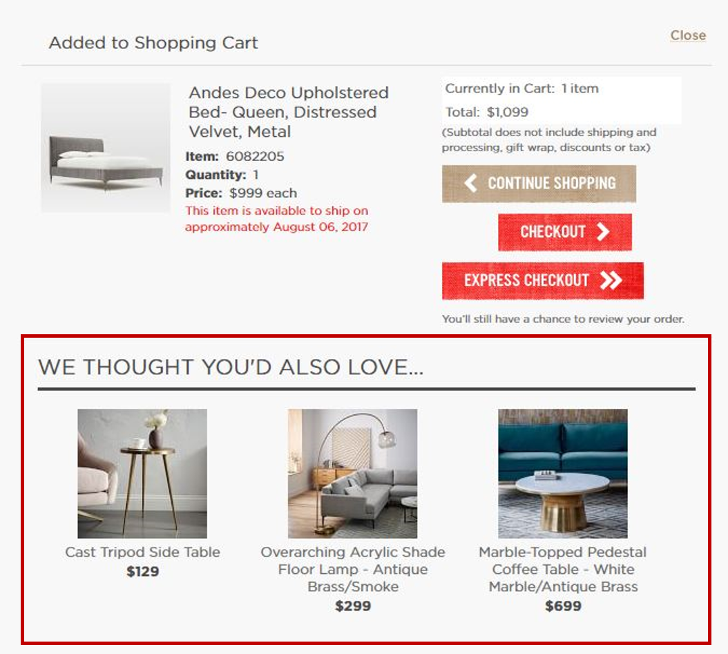
-
Ability to add items to Cart from current page.
-
Cross-selling of incremental, noncompetitive buys.
-
Reduced number of products to avoid choice paralysis.
-
Strategy messaging leverages brand authority.
Cart Page
Highlights:
-
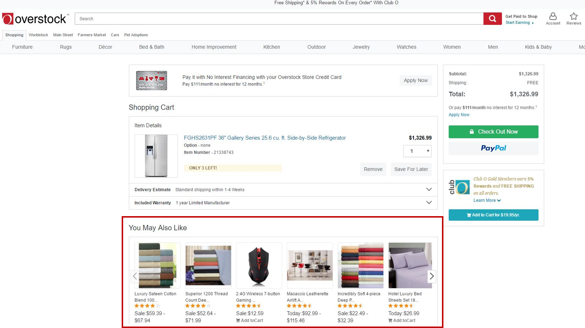
Recommendations positioned to not obstruct checkout flow.
-
Quickview enabling Cart incrementation without leaving the page.
-
Reduced number of placements and products to avoid choice paralysis.
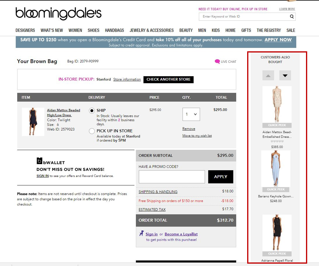
-
Recommendations positioned to not obstruct checkout flow.
-
Ability to add to cart without leaving current page.
-
Items are relevant incremental buys; not competitive with Cart contents.
-
Reduced number of placements and products to avoid choice paralysis.
