Overview
This guide provides guidance on optimizing email recommendations delivered by Recommend. After reading this guide, you can answer the following questions:
-
How do we measure the effectiveness of email recommendations?
-
What should email recommendations look like?
-
What kinds of strategies should we use to maximize revenue and how does this vary across campaign types?
-
What are the user experience caveats and considerations that we should be mindful of when configuring email recommendations?
Note: Every retail site is different and what works best for one is not guaranteed to translate into gains for another. As such, treat this guidance as general best practices—a foundation for optimization from which site-specific tuning should occur.
Following the guidelines on the pages that follow helps safeguard the performance of Recommend in email.
You should understand the logic behind our optimization methodology, and the questions to ask, so that you can adapt and apply as appropriate.
Supported Campaign Types
Recommendations are effective across a wide variety of email campaign types—from promotional emails with a broad context (for example, sitewide sale) to more triggered communications that are deployed after a specific customer event such as a purchase or an abandoned cart. The following is a non-exhaustive list of email types that can be augmented with product recommendations:
-
Order confirmation
-
Shipping confirmation
-
Browse remarketing (that is, to lure disengaged customers back to the site)
-
Abandoned cart
-
Sale/promotion notification
Campaign Success Metrics
Retailers strive to maximize ROI from email marketing, and when used appropriately, product recommendations are a great tool for driving customers back to the site. When defining success, it’s important not to target Recs Sales, sales of items clicked on in recommendations, as a key metric. Email recs tend to drive much higher sales of non-recommended items, so getting customers back into the funnel to purchase something becomes the priority.
For email recommendations, Total Campaign Sales (calculated on a per view basis) is the primary success metric. This is revenue from customers that clicked through to the site from email recommendations. Click-through Rate then becomes an important secondary success metric as Total Campaign Sales is largely a function of engagement.
Configurations Best Practices
As the objective is to maximize revenue by maximizing clicks back to the site, position the recs placement as high up in the email template as possible without compromising the core objective of the email. While we typically prefer horizontal placements, treat vertical layouts as a way to work around design constraints and to fit recommendations higher up in the email, particularly in longer, content-heavy templates.
Note: You can set up email open URLs and click-through URLs on your domain using an API Gateway-based reverse proxy solution. You can find the guide to set up a reverse proxy solution on this page.
Layouts Best Practices
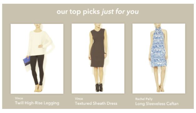
The email recommendations layout should elicit engagement and provide the core information required to lure the customer back to the site. The intent is to make recommendations stand out relative to other email content, but not in a way that's visually disjointed. Below are examples of several effective email recommendation layouts followed by important design guidelines that dramatically impact engagement:

Product Name
-
For catalogs with visually distinct inventories in which the draw is the product’s look rather than its specifications, product name is less important and we are fairly indifferent as to its inclusion. This is usually the case within Apparel or Furniture as customers are inspired by imagery and not the product’s name—unless we believe that the mention of brand elicits engagement. Electronics catalogs, however, tend to have visually homogenous inventories; all televisions generally look alike, so it is important to expose differentiating attributes such as brand, screen size, display format, and resolution in the product name.
-
If the product name is included, limit it to 2-3 lines using an ellipsis to handle overflow. We want to ensure that we provide enough of a description for the customer to discern what the product is—but not so much that it overwhelms the customer or breaks the placement layout.
Product Images
-
At minimum 120 x 120 px. Ensure that for email recommendations, we can go larger than onsite recs, which is particularly useful for catalogs whose products have a strong visual aesthetic (for example, Apparel). Again, when optimizing for engagement, product imagery is one of the most impactful levers for getting customers back to the site.
-
To the extent that this does not create load performance issues, we seek the same or better image resolution as is used elsewhere on the site.
Product Quantity
Display 3-4 products at minimum
Pricing Display
-
Price is not an absolute requirement for email recommendations.Price can sometimes deter clicks as it introduces another dimension upon which to evaluate a product. Remove the price and mitigate customer intimidation from high-ticket items. Instead, the customer will view the price once they land on the site, where they can absorb other salient information that communicates value. The exception is retailers with aggressive pricing strategies to appeal to bargain-buying; these retailers should flaunt their prices as they’re key influencers in driving customers back to the site. In general, do not display price if it is not a factor that will elicit clicks.
-
If the price is included, showcase regular and sale prices, as well as MAP messaging (for example, “add to cart to see price”) if applicable.
-
Emphasize sale pricing. If an item is discounted, strikethrough the regular price and display it in a smaller font. Present the sale price in a prominent color and include a “save story” to underscore the discount—dollars saved or % off. Don’t make the customer do the math.
Ratings
If available, include these as they reinforce customer confidence in recommendations. Add the ratings count in parenthesis.